Colors – what else could I be thinking of…
Snapshots taken in Second Life (or renderings from most 3D software for that sake) can easily be a bit bland and lacking in color and contrast – due to many boring reasons.
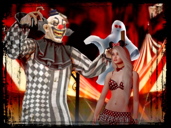
Some easy postprocessing can be the way so save a picture that is lacking the little extra that makes it pop – let’s take the picture over here as an example…
I’m not really THAT into halloween, but I wanted to do my take on a scary halloween photo, this is what I came up with:

(Well, I’m kind of afraid of mice, so this is a scary outfit for me)
Looking closer at the picture, I felt like I was looking like a grey mouse (pun intended 😉 ) in the picture – my skintone came out greyish and bland in the light available in that shot. My solution? Some easy postprocessing of course…
The only tool I’ve been using since I started this blog is a free application called FastStone Image Viewer – I mainly use this to browse through the snapshots I take inworld, select the good one and do some cropping (more on that – and composition in general – later).
But it also has a few good functions when it comes to virtual lighting and colorgrading – so here’s what I did:
Not that much really, but I turned up the contrast a little bit – the color intensity a little bit more, and finally tweeked the color slidesr until I ended up with that Fifties-horror-movie-poster/cheap-pocketbook-cover look… And I even added ( a somewhat cheesy) effect frame to it to really go over the top 😉
So, this is all the halloweeny stuff you’re going to get from me this year 😀


